Status
Not open for further replies.

mneylon

Administrator
Staff member
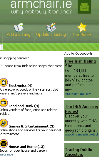
I'm trying to get the adsense integration on Irish Ecommerce Directory - Online Shopping in Ireland to be perfect!

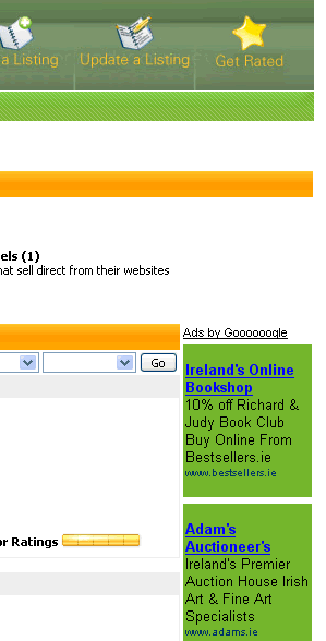
Which colours should match with which other elements?

At the moment I've got the following colour combinations:

Main Page - uses the green from the header


Category page - uses the green from the search bar


Any feedback would be welcome
 

comado

New Member
Hey Michele,

Take a look at Irish Fashion Ireland, fashion news, beauty news, beauty tips, fashion tips - Fashion.ie Ireland or Irish clubbing ireland, clubbing news, clubbing event listings - Novadance.com Ireland for how we integrate ours. We're having clickthru rates of around X - its best to keep a clear background, and have the link colour either a link colour consistent with the default link colour on your page, or the default 'blue'.

H
 

mneylon

Administrator
Staff member
Hugh

Both of those sites have much lighter colours than Armchair....

If I use the white background they look a bit odd tbh...
 

Gavin

New Member
How about having the same type of sidebar on the right as you do on the left and then use the white background as comado suggested? Apparently the white background with no border performs better.
 

Gavin

New Member
So put an orange header / bar over the ad block and use a white background?

Yes that should work.

I think you can use the word sponsors inside the orange header if you need text to match the left side - double check the TOS on that one.
 

RedCardinal

New Member
Hey Michele,

Take a look at Irish Fashion Ireland, fashion news, beauty news, beauty tips, fashion tips - Fashion.ie Ireland or Irish clubbing ireland, clubbing news, clubbing event listings - Novadance.com Ireland for how we integrate ours. We're having clickthru rates of around X - its best to keep a clear background, and have the link colour either a link colour consistent with the default link colour on your page, or the default 'blue'.

H

gotta love the keyword stuffing in those links though :D
 

mneylon

Administrator
Staff member
Yes that should work.

I think you can use the word sponsors inside the orange header if you need text to match the left side - double check the TOS on that one.
I'll have to double check.. I know there are some terms that they allow and others that they really don't like....

Looking at the heatmap I wonder would shifting the positioning to the left and moving that content to the right help?


Gavin

New Member
Looking at the heatmap I wonder would shifting the positioning to the left and moving that content to the right help?

I actually thought about that when I peeked at your site but I didnt want to side track you as your question was on the colour scheme ;)

I have tested having the Adsense on the left side bar vs the right and did find the best performance was having the ads on the left. This was tested on two sites and works well for them but it did take a couple of weeks to really see a difference.
 

mneylon

Administrator
Staff member
I actually thought about that when I peeked at your site but I didnt want to side track you as your question was on the colour scheme ;)

I might as well get it right now and not have to mess with it again :)
I have tested having the Adsense on the left side bar vs the right and did find the best performance was having the ads on the left. This was tested on two sites and works well for them but it did take a couple of weeks to really see a difference.

How much of a difference did it make?
 

mneylon

Administrator
Staff member
Ok. Ad block moved to left and content swapped around ...

Background colour switched to white

Any other thoughts?
 

Gavin

New Member
How much of a difference did it make?

Right hand side would pull in around 5-10 clicks and the left 20-40 with no major change in traffic.

You may need to move the orange header "Sponsored Links" down a tad and make it level with the top of the text in the middle and the "Top 5 Shopping Sites" header on the other side. I would also try the 160x600 instead of the 120x600 so it fills more of the white space on the right of that banner.

The Adsense text links at the bottom I would make them all black match them with the colour of "Ads by Google". I also found that having the text links at the top of the page works really well but downfall is you loose visitors from the site a lot faster.

If you were to move the text links to the top I would place them between the green search bar and orange header, aligned to the middle. I would personally think it may look cluttered at the top though.
 

mneylon

Administrator
Staff member
Cormac - thanks for the tips :)

I've made the changes you suggested on the main page and I think it looks a lot better.

The alignment issue was due to an extra line break tag on one side of the page, so that's sorted now

Regarding the text links - I decided to leave them down the bottom for the moment

Would putting any of the product referrals make any sense or would that be a total waste of time?
 

Seohelp

New Member
Hi Michele,

The adsense looks an awful lot better. The orange on the homepage blend perfectly and the green on the results pages look a lot better.

Would putting any of the product referrals make any sense or would that be a total waste of time?
To be honest I would attempt to include only relevant referral schemes for each category. It would take a bit of work, but I really don't think that the generic adsense, adwords, firefox referals would drag in much €'s.

Chitka mini malls might be applicable for any of the electronic categories and can be good earners as well. Amazon for the books and music section. I'm sure a quick search on Google will bring up options for each of you categories.

As I said, this may take a bit more work, but you do have a captive audience that are looking to buy (if they are searching through a online shopping directory) and you can make the most of this target market by providing them with specific and targetted ads for each category.
 

mneylon

Administrator
Staff member
Hi Michele,

The adsense looks an awful lot better. The orange on the homepage blend perfectly and the green on the results pages look a lot better.

I'm probably going to make all the subpages fit in with the main one in terms of layout and colours, so it would be more consistent
To be honest I would attempt to include only relevant referral schemes for each category. It would take a bit of work, but I really don't think that the generic adsense, adwords, firefox referals would drag in much €'s.

Agreed. Maybe Picasa for the digital camera section?
The payout is pretty low though...
Chitka mini malls might be applicable for any of the electronic categories and can be good earners as well.
I'm yet to see any decent earnings with them .. I had them on a couple of sites, but found them to be a complete waste of time
Amazon for the books and music section. I'm sure a quick search on Google will bring up options for each of you categories.
I'm trying to make sure that whoever gets put in can cater for the Irish market properly. A lot of the international sites are not really geared for the Irish market
As I said, this may take a bit more work, but you do have a captive audience that are looking to buy (if they are searching through a online shopping directory) and you can make the most of this target market by providing them with specific and targetted ads for each category.

Hopefully :)
 

Gavin

New Member
Would putting any of the product referrals make any sense or would that be a total waste of time?

From what I read they seem to be a waste of time but I think its down to the site topic. I cant say for sure as I dont use them at all.

The Adsense looks really well on the site now and hopefully it will perform better. I undertsand about keeping the text links at the bottom ;)
 

mneylon

Administrator
Staff member
From what I read they seem to be a waste of time but I think its down to the site topic. I cant say for sure as I dont use them at all.

I've had one or two clicks, but not enough really ..
I put Picasa on the digital camera category for the moment, but Pixmania would be a saner fit

The Adsense looks really well on the site now and hopefully it will perform better. I undertsand about keeping the text links at the bottom ;)

Woohoo :)

It's still a work in progress, but I think the layout is more or less where I want it

The problem now is getting listings....

I did a search this morning for some of the topics and all I could find were brochure sites... *sigh*
 

frakilk

New Member
Blacknight, I share your addiction. I don't know how my members put up with my AdSense tweaking but they did :)

I have a few suggestions. First up the home page:
- Darken the orange links to match the darkest part of the orange gradient in the gif above the AdSense. IMO they are too hard to read as they are.
- Make the url colour of the AdSense ads the hex value #567E96. This will match the light blue text underneath a category's description to the right.

Category listing page.i.e. Armchair.ie - Irish Shopping Directory > Books and Music - Irish Online Shops - Browse by category
- Make the url colour of the AdSense ads the hex value #7CB930. This will match the light green text for the category links to the right.
- You may also want to at least test what a light grey border hex value #ECECEC looks like around the ads. This is to blend in with the light grey bars behind the category names.

Hope this helps.
 
Status
Not open for further replies.
Top